✏️ SERVICES
Creative ideation
Research, Testing, UI, Illustration, Content strategy, UX, Copywriting, Business planning, Coding, Prototyping, Marketing
📅 DATE
2018
⚙️ SECTOR
PWA APP
⚙️ SECTOR
Gardening, environmental, and sustainability
BRIEF
TERRA ME is a passion project co-founded by myself and Angie Eckstein, born from a shared love for gardening and a belief that caring for the earth starts with small, everyday actions.
We set out to explore how digital tools could support people in building healthier relationships with their plants and, in turn, with nature. The ambition was not to over-engineer gardening, but to make plant care feel approachable, achievable, and rewarding.
DESIGN CHALLENGE
The initial spark for TERRA ME came from a simple conversation. Over coffee, Angie and I shared a common frustration. Despite genuine interest and good intentions, we both struggled to keep our plants alive.
Through early conversations, we uncovered a broader pattern. People found plant care information scattered, inconsistent, and often overwhelming. Reliable guidance existed, but it was difficult to find, hard to understand, and rarely tailored to real life constraints such as time, experience level, or confidence.
The challenge became clear.
How might we design a single, accessible platform that helps people care for their plants with confidence, without requiring expert knowledge or constant effort?
SOLUTION
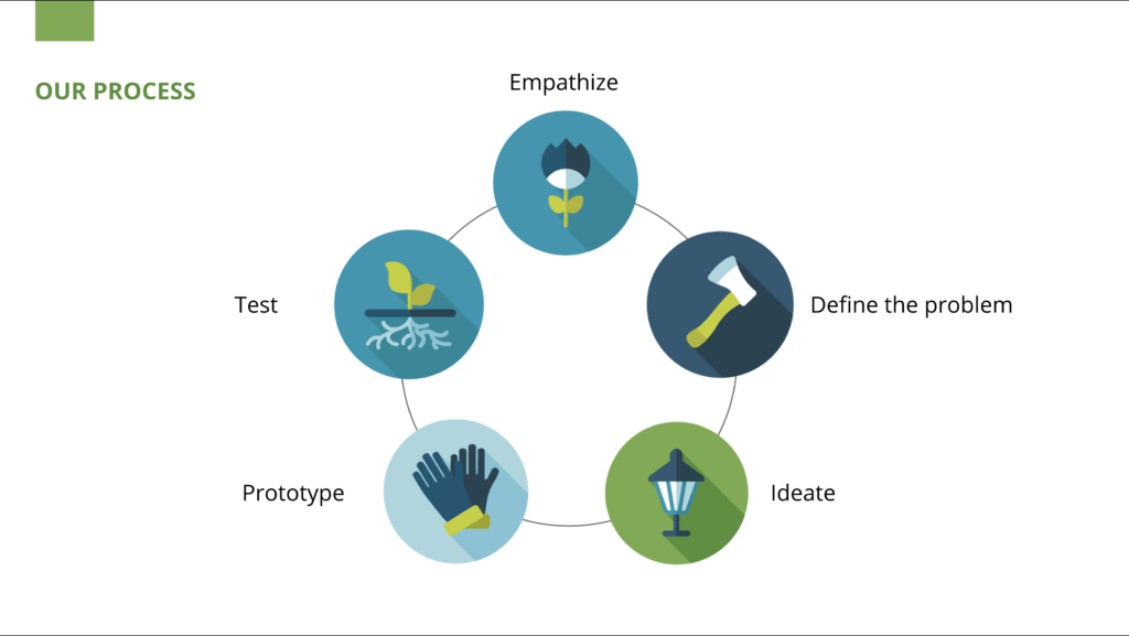
We approached the problem through a design thinking lens, with a strong emphasis on validation and iteration.
Our hypothesis was that people would benefit from a simple, technology-enabled solution that removes barriers such as lack of time, lack of knowledge, and information overload. The solution needed to provide clear, actionable guidance while encouraging consistency and enjoyment.
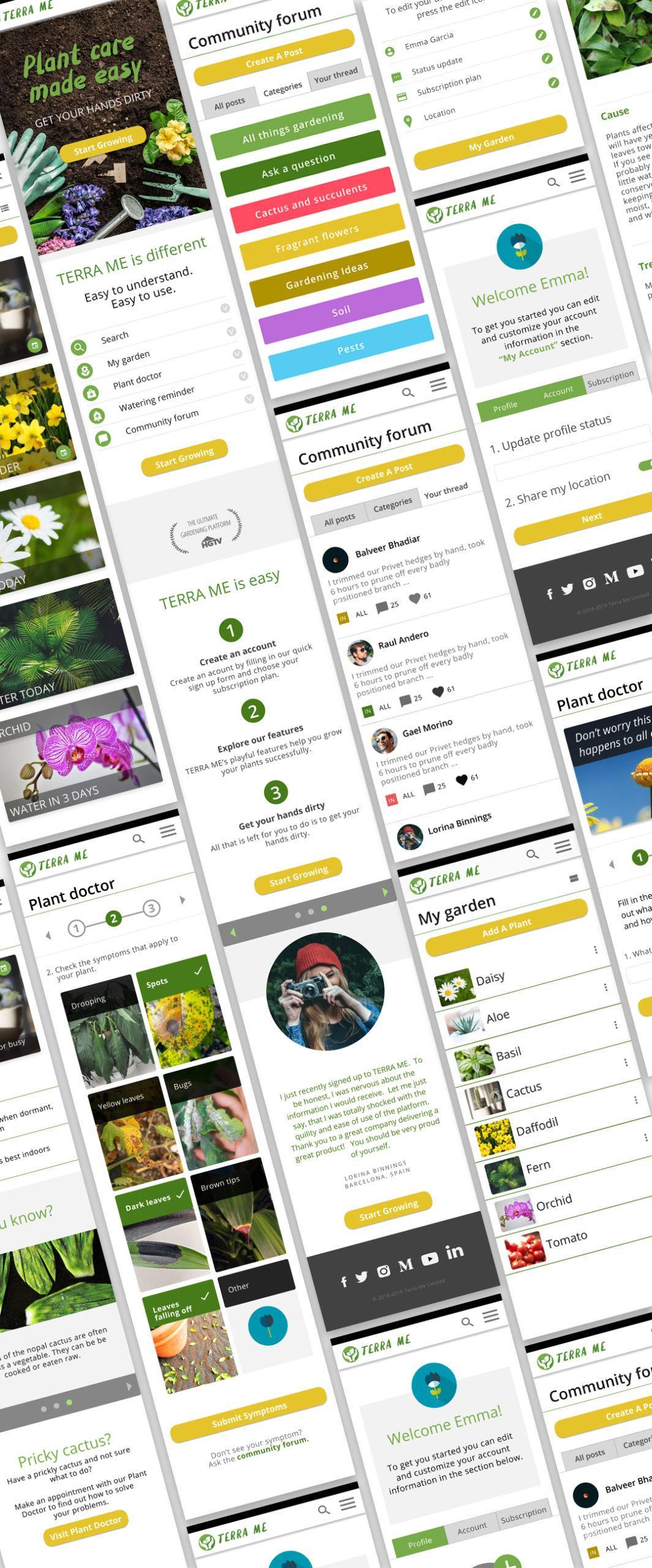
We ultimately landed on a Progressive Web Application that combined:
-
Simple, easy to understand plant care guidance
-
Reminders and lightweight accountability
-
Diagnostic support for common plant issues
-
A community layer for shared knowledge and encouragement
RESEARCH & DISCOVERY
Research was continuous throughout the project and formed the backbone of every design decision.
We conducted:
-
User interviews with gardeners of varying experience levels
-
Surveys to understand habits, frustrations, and digital behavior
-
Field research at garden centers
-
Guerrilla interviews on the streets of Barcelona
The core research questions were:
-
Are people looking for a technology-enabled plant care solution
-
Who are the most relevant target users
-
What are their primary pains and motivations
-
What features would create real value in a plant care platform
SURVEYS
We designed and distributed a survey using Google Forms, shared within my network.
-
41 people accessed the survey
-
32 participants completed it after screening
-
None of the respondents were using a plant care app
This insight informed a key decision to focus on a responsive web experience rather than a native app.
KEY USER PAIN POINTS:
-
Plant care information feels overwhelming
“I am hungry for specific and simple information and looking for guidance.” -
Finding reliable information takes too much effort
“I have been gardening for many years and still spend a lot of time searching online, going to garden centers, and asking friends.” -
People forget to care for their plants
“I am pulled in many directions with family and work and often forget or don’t have time to take care of my plants.” -
Users struggle to understand what is wrong with their plants
“I have been gardening for four years, but still have mixed success and do not know why.”
PAINPOINTS
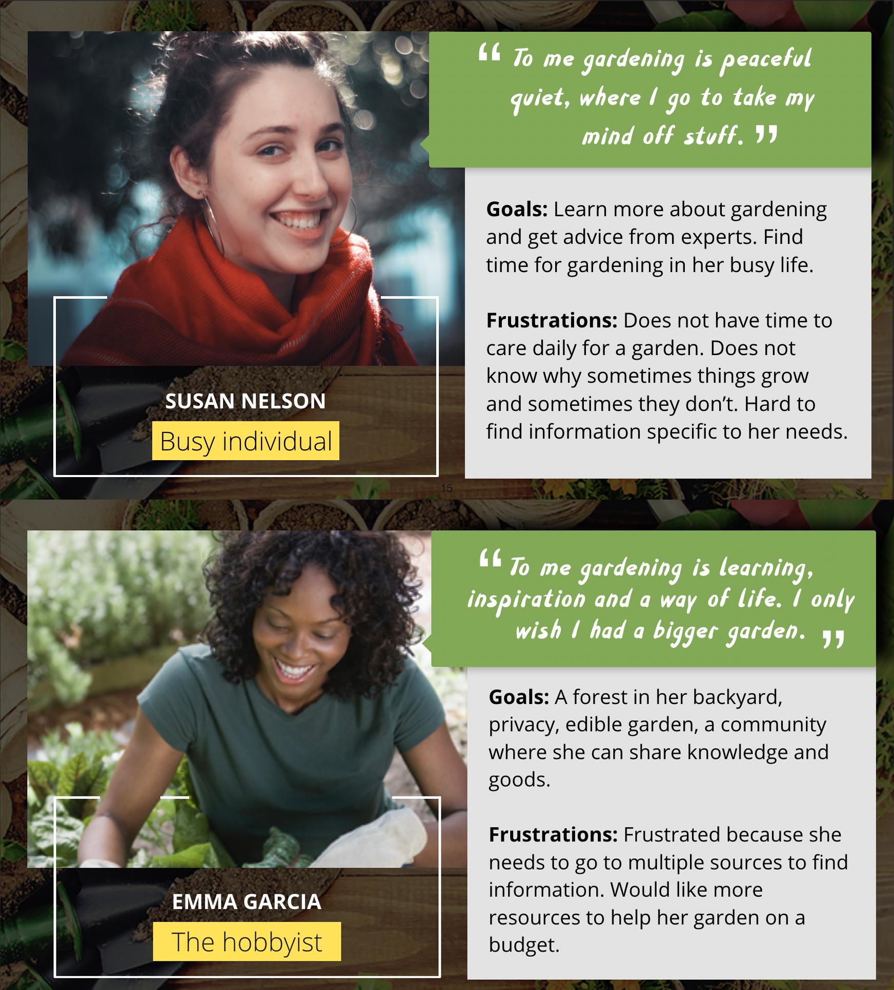
Based on our research, we identified four personas:
-
The busy individual
-
The hobbyist
-
The family gardener
-
The recurrent struggler
We identified the busy individual and the hobbyist as primary personas, while also acknowledging that the platform would work best as a two-sided ecosystem. One where users both seek and contribute plant care knowledge.
DESIGN AND PROTOTYPING
With research insights, personas, and a clear product vision in place, we moved into prototyping.
We began with paper prototypes, using low fidelity sketches and Post Its to simulate interaction. This allowed us to test flows quickly and document user behavior without over-investing in polish.
We then progressed through low and mid fidelity prototypes, continuously testing and iterating based on feedback.
TESTING AND ITERATION
We tested the paper prototype with seven participants. Users were asked to:
-
Search for a plant
-
Add it to their personal garden
-
Understand basic care requirements
Testing validated the core idea and revealed:
-
Common navigation paths
-
Language that resonated with users
-
Features that added clarity versus noise
Each testing round informed refinements to structure, wording, and interaction.
ANALYZE AND SYNTHESISE
After the interviews and surveys, we reviewed our notes and recordings to identify themes and user pain points. I wrote each pain point on a post-it and then clustered each pain point under a theme. Four themes emerged including, “Gardening Problems”, “Why people garden”, “How people get gardening information”, and “Problems finding gardening information”. From these themes, we narrowed down our findings into four pain points. The quotes from our interview participants help shed light on each pain point.
DESIGN PRINCIPLES AND BRANDING
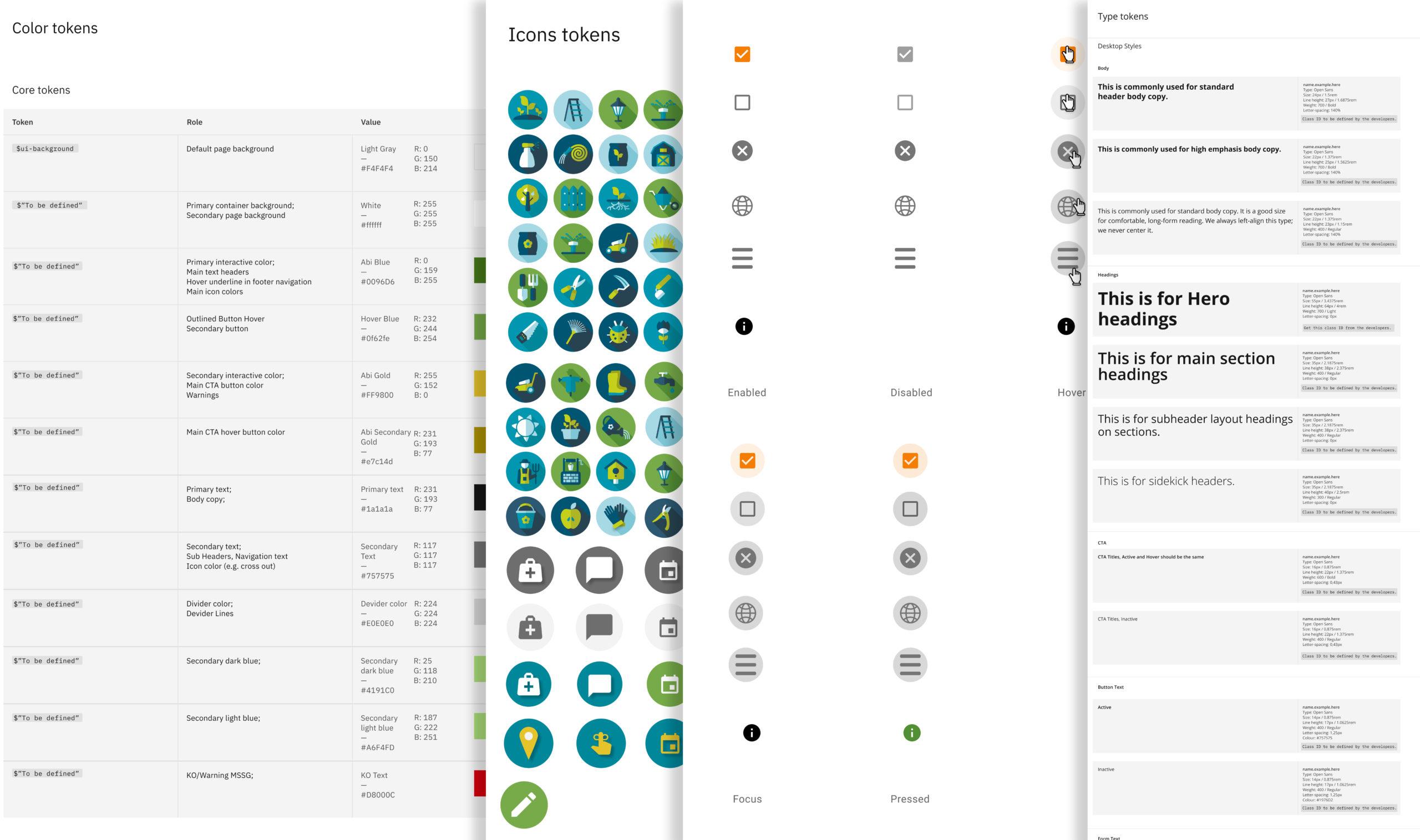
We established clear design principles to guide the experience, focusing on clarity, simplicity, and calm.
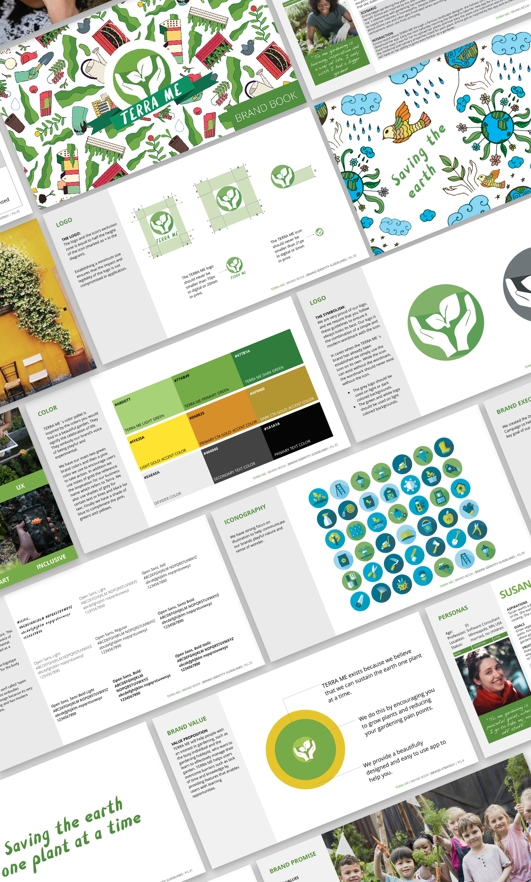
In parallel, we developed a complete brand system, including brand strategy, visual identity, and content direction. The goal was to create a visual language that felt natural, grounded, and supportive rather than technical or overwhelming.
The brand book served as a shared reference point throughout design and iteration.
PROTOTYPING
With our research, brand book and personas in place, we began to prototype solutions beginning with paper prototypes. We created paper wireframes and used Post Its to create mock interactive elements for each screen. To select an item on the paper screen, the user placed a Post It on top of the UI element. The Post It served as a reference for documenting the path the user took through the screens after the testing.
TESTING
We tested the paper prototype with seven participants. Users were asked to search for a plant and add it to their garden. From the prototype, we were able to validate that the idea was useful, learn common paths that users took to perform the tasks, and learn about features and wording that would be helpful for the users.
DESIGN PRINCIPLES
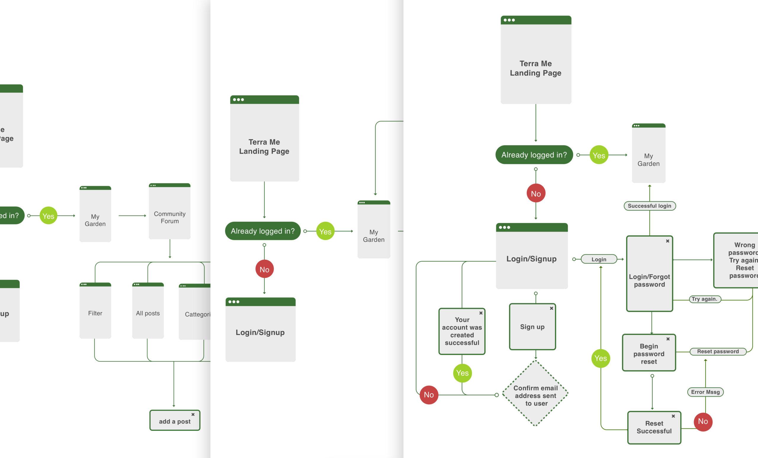
We began by designing and implementing design principles. Then moved on to user flows, user journeys, and wireframes. In addition to low-fi and mid-fi prototypes. After each round of design, we would test with users and iterate the designs.
BRANDING
Below you can see the brand book that TERRA ME is built on. In the book, we cover brand strategy, brand identity, and content strategy.
OUTCOME AND REFLECTION
The final prototype brought together all core features:
-
Sign in
-
Plant search and profiles
-
Water reminders
-
Plant diagnosis support
-
Community forum
TERRA ME demonstrated the value of disciplined design thinking combined with deep empathy for real user needs. While the ideation phase surfaced many potential directions, research kept us grounded and focused on solving the most meaningful problems.
We designed TERRA ME to be one calm, trusted place where people can find the information and support they need to care for their plants with confidence. Our hope was to help users overcome barriers such as time and knowledge, and to reconnect them with the joy of nurturing living things.
Get In Touch
Liked what you saw and are curious to learn more, get in touch below.

