✏️ SERVICES
Visual Identity & Packaging
📅 DATE
2012
🖥️ PRODUCTS
Branding and Packaging
⚙️ SECTOR
Commercial Consumerism
BRIEF
Glen Tea is a brand rooted in connection. Sharing conversation, laughter, and time together over a strong, fresh cup of tea has always been at the heart of what it represents.
As consumer expectations and visual culture evolved, the existing brand began to feel dated and no longer resonated with younger audiences. The challenge was to refresh the identity while preserving the warmth and sense of togetherness that defined the brand.
The goal was to create a visual language that felt modern, confident, and approachable, without losing the emotional familiarity associated with Glen Tea.
DESIGN CHALLENGE
The core challenge was balancing continuity with change. The brand needed to evolve visually to appeal to a younger market segment, while remaining recognizable and credible to existing customers.
This meant moving away from overly detailed or traditional design cues and toward a simpler, bolder, and more contemporary expression.
SOLUTION
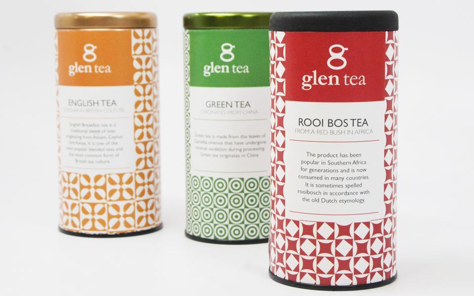
I redesigned the Glen Tea identity and packaging system with a focus on clarity, warmth, and modernity.
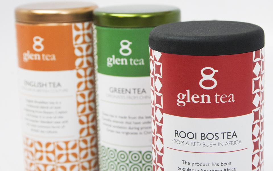
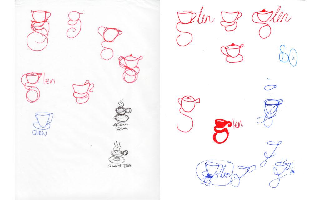
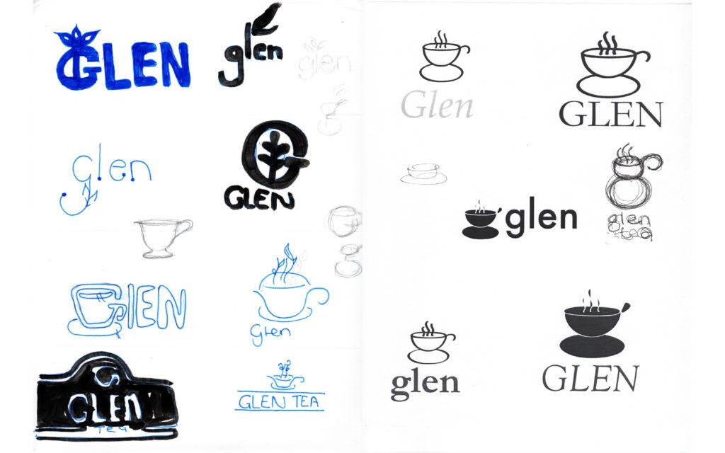
The logo mark was reimagined using the letter “g” from the brand name, transformed into a simplified teacup form. The resulting symbol can be read both as a letter and as a visual representation of the product itself, creating a distinctive and memorable brand asset.
The packaging system introduced:
-
Bold, rounded forms
-
A cleaner and more confident visual language
-
Strong use of color to differentiate tea varieties
-
A modern aesthetic that feels fresh rather than nostalgic
Color became a key functional and emotional element of the system, with each tea type represented through its own palette. For example, green tea is reflected through green tones across both logo and packaging, creating immediate recognition and shelf clarity.
OUTCOME
The refreshed identity positioned Glen Tea as a brand that honors tradition while confidently stepping into the present. The new logo and packaging system created a more contemporary shelf presence, improved clarity across product variants, and opened the brand to a younger, more design aware audience.
This project reflects my approach to brand evolution. Respect the essence of what already works, simplify with intention, and design systems that feel both relevant today and resilient for the future.


Get In Touch
Liked what you saw and are curious to learn more, get in touch below.
