✏️ SERVICES
Visual Identity
📅 DATE
2012
🖥️ PRODUCTS
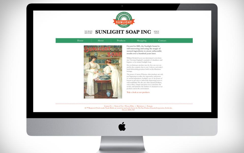
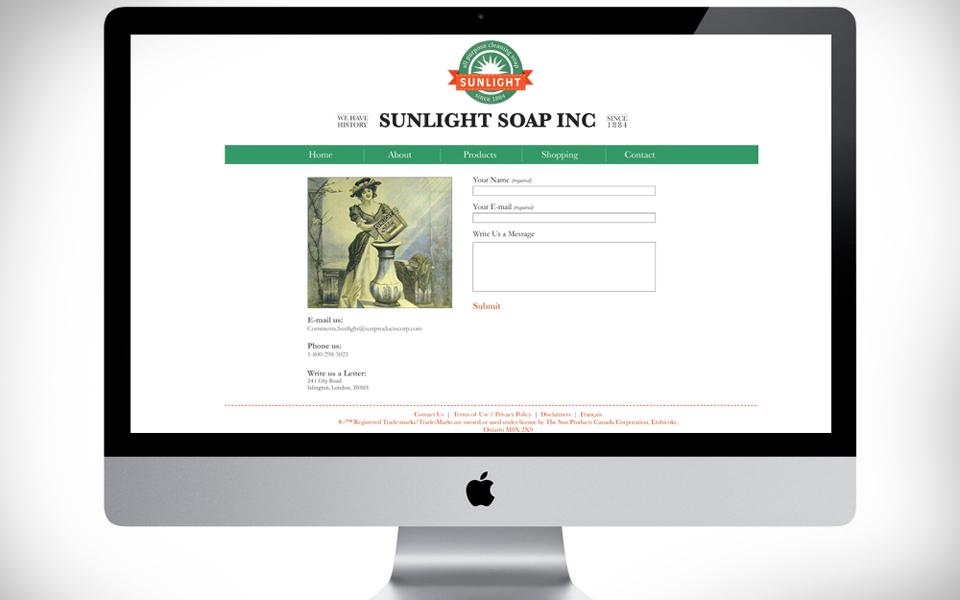
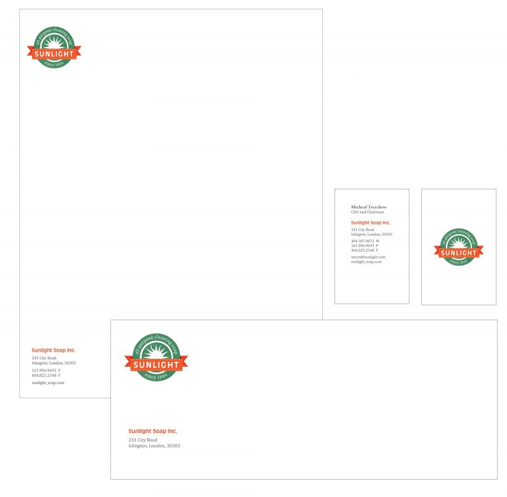
Branding, Packaging and Web
⚙️ SECTOR
Commercial Consumerism
BACKGROUND
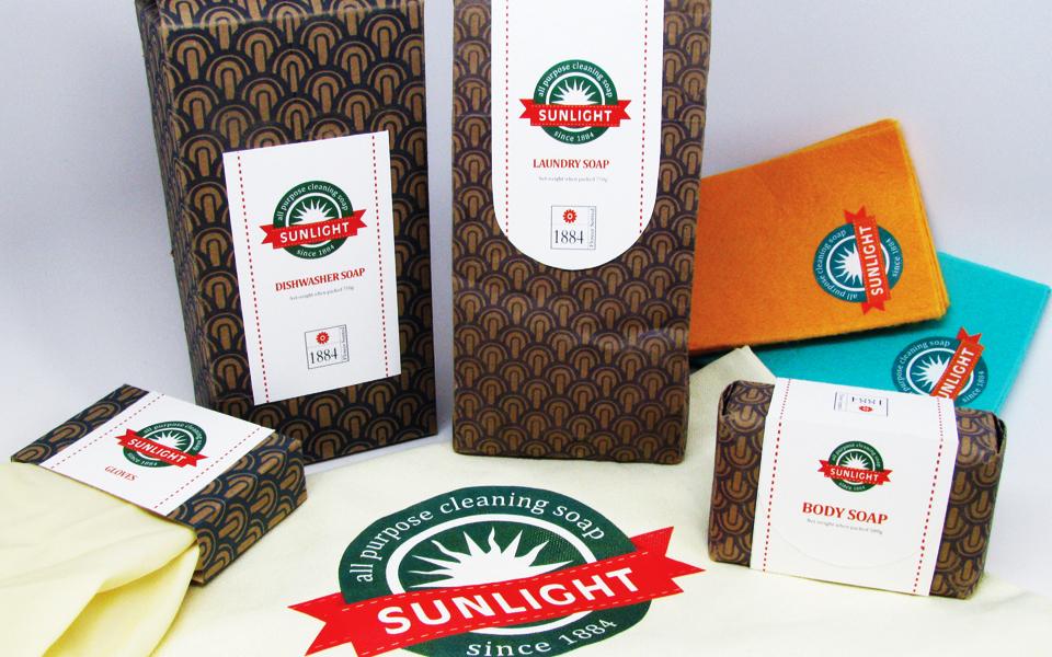
Sunlight Soap is an all purpose cleaning brand owned by Unilever, with a rich history dating back to 1884 when it was first introduced in England by the Lever Brothers. It is widely recognized as the first soap to be branded and packaged, marking a pivotal moment in consumer goods history.
The brand built its reputation on versatility, affordability, and natural ingredients derived from vegetable oils such as palm oil. The name Sunlight pays tribute to the workers of the local town of Port Sunlight, reflecting values of dignity, community, and honest labor.
PROBLEM
Despite its strong heritage, the everyday cleaning product category has become increasingly cluttered. Multipurpose products compete across shelves with little differentiation, often relying on functional claims rather than emotional connection or visual distinction.
Within this landscape, Sunlight Soap risked blending in rather than standing out. The challenge was to reimagine how the brand could express its history, environmental consciousness, and broad utility in a way that felt relevant, engaging, and distinctive.
APPROACH AND SOLUTION
The design approach focused on reconnecting Sunlight Soap with its core strengths while elevating its visual presence.
The goal was to create branding that:
-
Honored the brand’s long standing heritage
-
Communicated its environmentally conscious ingredients
-
Reinforced affordability and everyday usefulness
-
Visually stood apart in a saturated market
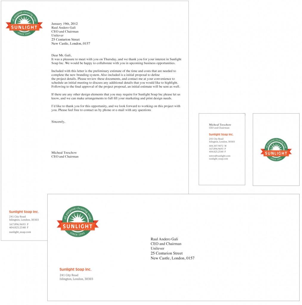
The solution emphasized warmth, clarity, and approachability, reflecting the idea that Sunlight Soap is a reliable companion for daily life. Rather than fragmenting the brand into narrowly defined use cases, the design reinforced its versatility. One product that supports many cleaning needs, from laundry and dishes to household surfaces.
OUTCOME
The resulting concept positioned Sunlight Soap as both timeless and relevant. By drawing on its history while modernizing its visual expression, the brand was reintroduced as a product rooted in trust, simplicity, and everyday value.
This project reflects my approach to heritage brand work. Respect what has endured, clarify what matters most, and design with enough restraint and confidence to allow the brand’s story to speak for itself.

Get In Touch
Liked what you saw and are curious to learn more, get in touch below.

